INCREASING PLAYER SATISFACTION THROUGH USER CENTERED DESIGN
OVERWATCH 2 UX/UI REDESIGN
UX/UI DESIGN
USER RESEARCH
ROLE
LENGTH OF PROJECT
7 WEEKS
PROJECT TYPE
CASE STUDY
TOOLS
PHOTOSHOP
FIGMA


PROJECT OVERVIEW
THE PROBLEM
THE GOAL
CHALLENGES
While Overwatch 2 has mostly clear and concise UX/UI there are a few cases where things can be hard to find or confusing to players. One area of confusion most players faced is that the settings menu was not directly displayed on the main menu and was hard to get to. The other problem we focused on was providing more information on the character select screen to help players make a more educated decision on who they might want to play.
The primary goal of this redesign is to provide the players with all relevant information they might be looking for while retaining clear and concise UX/UI to reduce confusion.
Bridge the game development intentions with player experience
Provide all information wanted without being overwhelming
Keep the origional feel of OW2 that players are familiar with
SOLUTION
The first step was to remove the settings screen from the “ESC Menu” and bring it front and center on the “Main Menu” where players were expecting to find it. As for the “Character Select” screen the only was to learn more about each character was to push a button to take you to a separate screen that would display that information, and many people didn’t know was there. To fix this we removed this secondary screen and instead displayed each characters abilities on the screen while you are selecting and hovered over who you want to play.
WORK PROCESS

RESEARCH
KNOWING THE PROBLEM
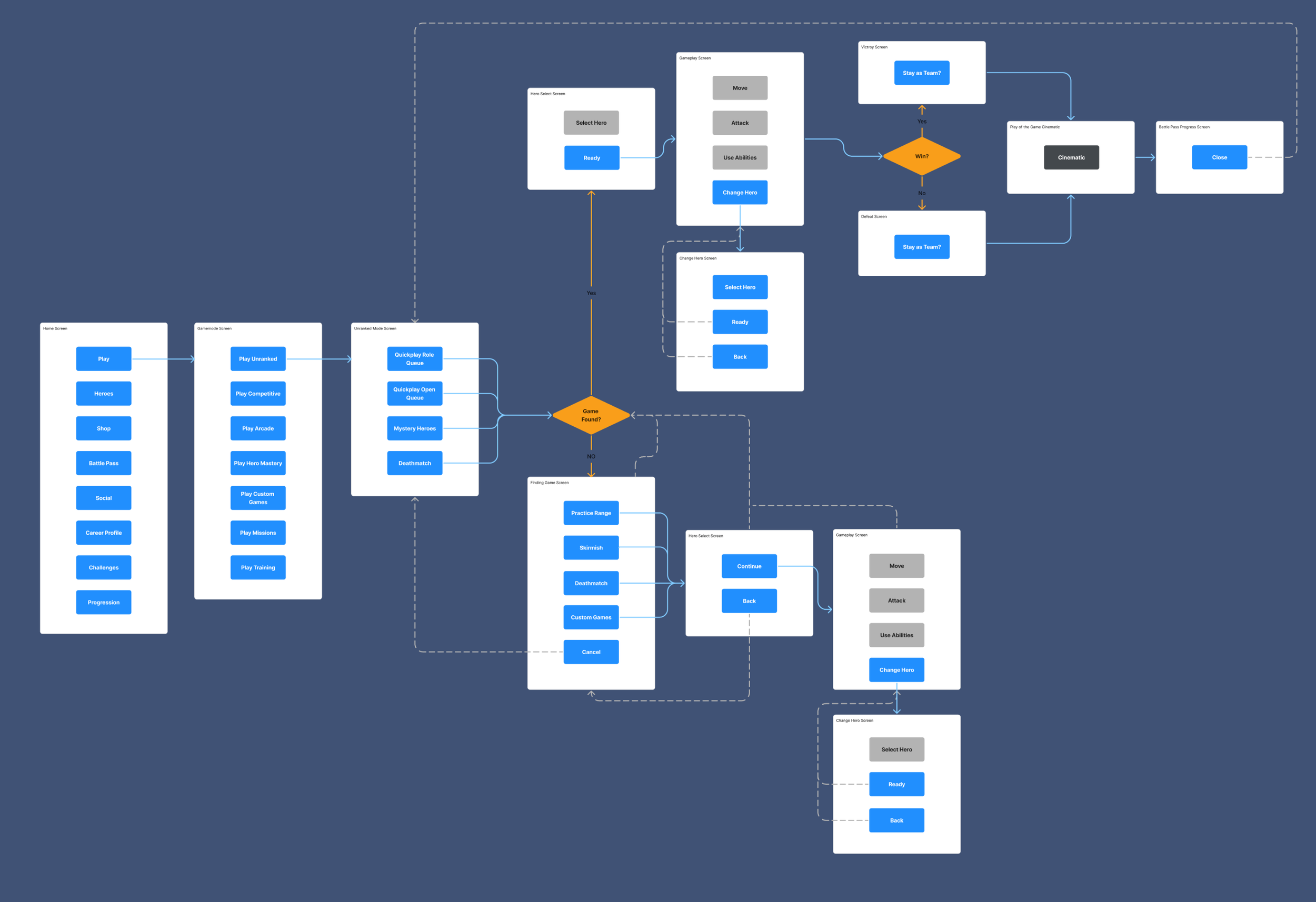
In order to find the problem we must first understand the product and what its trying to achieve. We do this by first going through the players journey, player prototype and flowchart of the games menu’s and how they interact with each other. We can then break down this screen-to-screen experience and the player experience and begin to identify what is working and where there are areas for improvement.
PLAYER JOURNEY

PLAYER PROTOTYPE

FLOW CHART

SOLVING THE PROBLEM
WIREFRAMING
Now that the problems have been identified we can begin making our initial wireframes and begin coming up with solutions to those problems


USABILITY TESTING
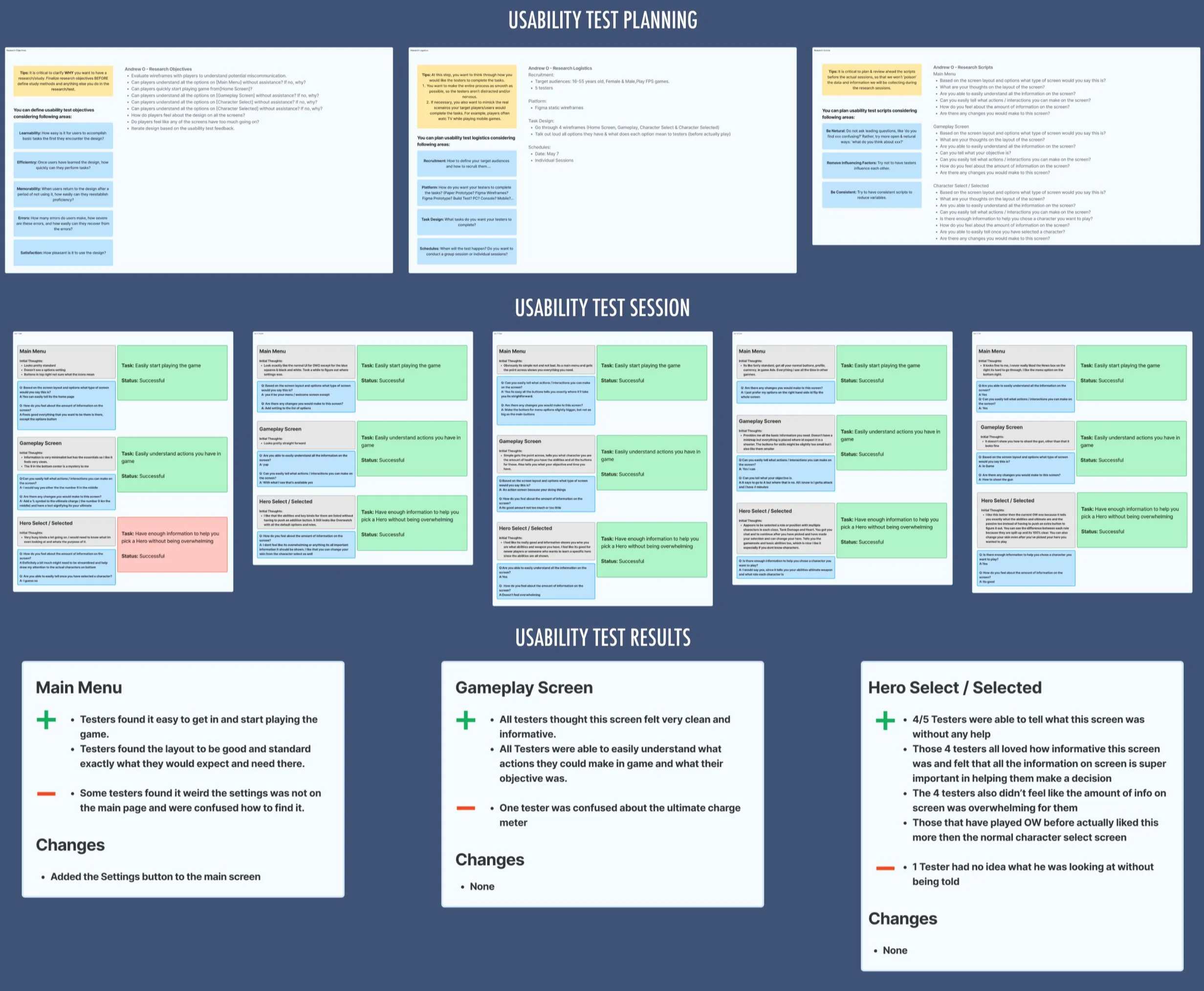
For our usability test we interviewed 5 different people, some which are avid OW2 players and some who have never touched the game. In these test we came to the conclusion that the changes that were made were super easy and clear for the players to understand. Everyone was able to find the settings on the main menu much quicker and easier with no confusion. The extra information on the character screen was super helpful in aiding them to make a decision on who to select, and they all liked the new layout more than the current one on the live client.

CREATING THE FINAL PRODUCT
MOOD BOARD > STYLE GUIDE > MOCKUPS
With our wireframes passing the User Testing stage, we now have the green light to start making our final mockups and renders of these screen. While doing this we aimed to stay true to the art style and mood that had already been established within the game.
MOOD BOARD

STYLE GUIDE

MOCKUPS
HOME SCREEN

GAMEPLAY SCREEN

CHARACTER SELECT SCREEN

CHARACTER SELECTED SCREEN

FINAL STEPS
ACCESSIBILITY TEST
With all the mockups done all screens need to go through one final pass to ensure that all screens are accessible to all of our players. Once each of our screens passes our color blind / weakness testing they can be approved and ready to ship to the live game client.

CONCLUSION
WHAT I LEARNED
Throughout the project I learned how to bridge the gap between game dev intentions and the players wants and needs using UX/UI. I also learned how to set up and Usability Tests / Interviews in order to further understand the needs of players and fix UX problems early on. Lastly I gained a better understanding of how accessibility challenges can be tackled in games.
OUTCOMES
All UI Mockups were a success and achieved the main goal of providing clear information to the player.
Achieved the goal of providing all relevant information and reducing the amount of sub menus in the game.
Testers loved the new Character Select screen and preferred it over the current one on the live client.
