INCREASING PLAYER SATISFACTION THROUGH USER CENTERED DESIGN
SMITE 2 UX/UI REDESIGN
ROLE
UX/UI DESIGN - USER RESEARCH
LENGTH
2 WEEKS
PROJECT TYPE
CASE STUDY
TOOLS
Figma - Photoshop
PROJECT OVERVIEW
THE PROBLEM
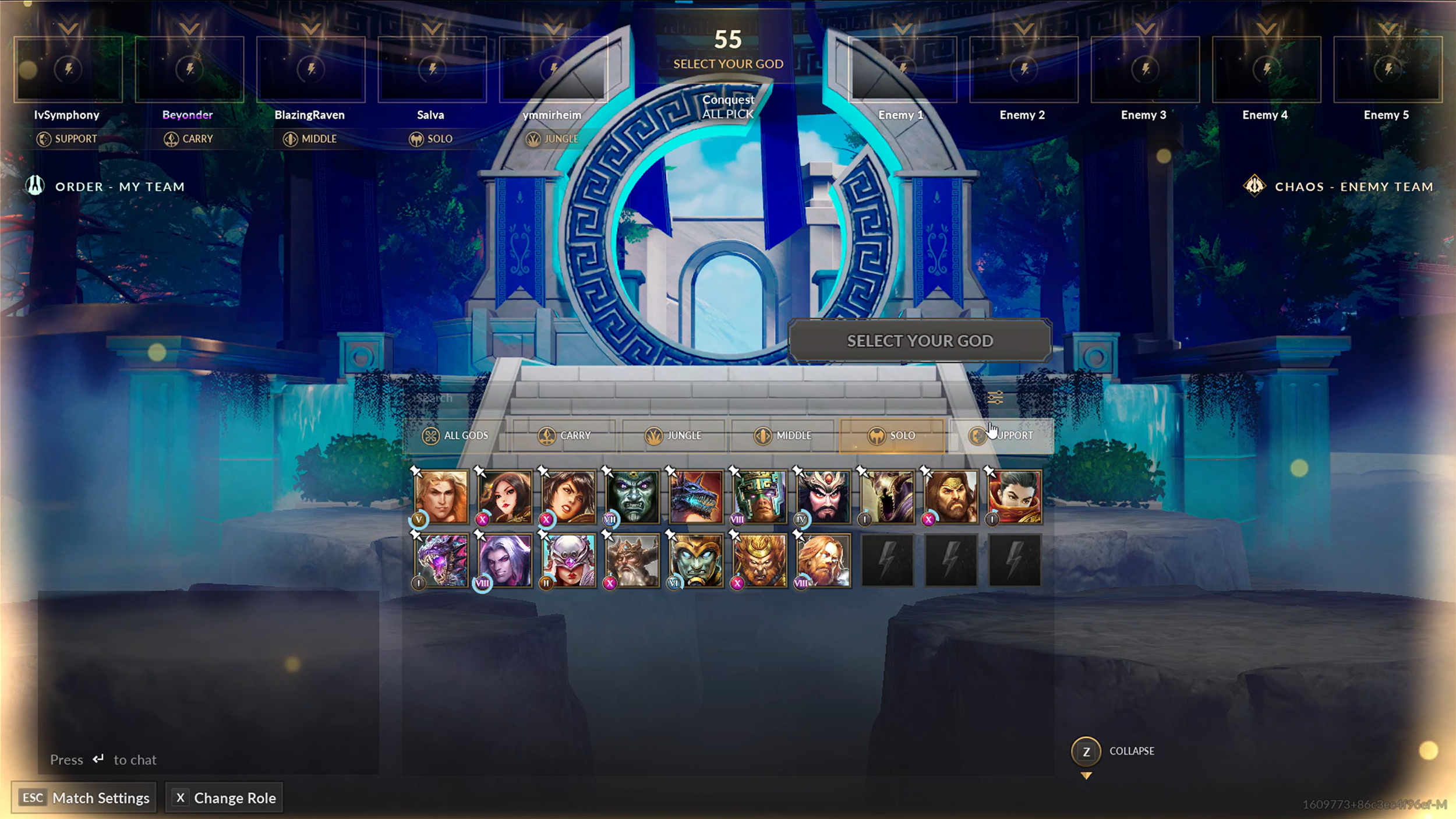
The current SMITE 2 God selection screen creates frequent confusion during the draft phase. Players often miss bans because the interface does not clearly communicate when they should ban. On top of that your able to ban the same game multiple times even when your teammate has already banned a certain God resulting in more wasted bans. Selecting a god offers no hover or confirmation state, which makes it unclear if a choice has been made. The god pick tiles start minimized, reducing readability and slowing decision making since you can only see 1 row of Gods to start. Pick order is difficult to understand at a glance, leading to uncertainty about turn timing. Overall, the screen lacks the stylized, powerful presentation that should reflect SMITE’s godly theme and competitive intensity.
THE GOAL
My goal is to redesign the SMITE 2 God selection screen to follow established UX/UI principles that players already understand from other competitive games. I want the layout, navigation, and visual hierarchy to be more intuitive and user friendly so players can focus on strategy instead of fighting the interface.
CHALLENGES
Balancing clarity with excitement. Enhancing visual hierarchy and feedback states without losing the dramatic, god-powered personality that defines SMITE’s brand will require careful styling and restraint.
Communicating complex draft rules. The interface must clearly show bans, pick order, turn timing, and team strategy without overwhelming players who are making quick decisions under pressure.
Optimizing for different skill levels. New players need clear guidance on what to do next, while veterans expect fast access to their preferred gods and advanced information, so the design must serve both audiences smoothly.
RESEARCH
KNOWING THE PROBLEM
To better understand real player frustrations, I gathered feedback directly from the SMITE community. These comments highlight recurring issues that impact the drafting experience and reinforce the specific usability problems identified in my analysis. Hearing these concerns in players’ own words helps ensure the redesign focuses on the moments that truly affect gameplay and satisfaction.
"For a first iteration it's not too bad. I really wish the god list was expanded by default (I don't need to see the whole screen when nobody even has picked yet). Also the thing that shows the bans looks bad rn."
"Clearer pick order info in ranked/draft. Show who picks when and on which side. Makes things way less confusing."
"This one doesn’t feel as clean, feels under worked. Whether it’s the boxes with the characters images or the « amount » of information in the middle or even the calligraphy. Most of the time people don’t ban because they didn’t realize it was their turn since the new update (nothing was explained in game, it was basically « figure it out). Also, on controller on assault its almost impossible to navigate between the character selection and other menus. I gotta spam all buttons and arrows and hope I’ll be able to change character."
“Honesty I liked the concept when they revealed it , but it's such a mess. The God selection only shows about 3 lines worth of God's at a time. The bans period isn't clear enough, just like in smite 1, so many people miss their ban. Just copy League for this, please. People do not miss their bans in that game. Also, you can ban the same God as a teammate somehow, and I have no clue how that happened.”
“I honestly liked the old one. It was more clean. The gods take too much space and the actual selection and gods selected are the the center piece and they should be at the god selection portion of the game.“
SOLUTION
This redesign focuses on bringing clarity, excitement, and meaningful visual guidance to the character selection experience. I plan to establish a stronger visual hierarchy that highlights ban and pick phases, improve feedback states so actions feel responsive, and display god options at a readable scale from the start. The layout will clearly communicate turn order and timing, reducing confusion and encouraging faster decisions. I will also elevate the artistic style to better represent SMITE’s godly identity, creating a screen that feels powerful, polished, and consistent with modern MOBA standards.

SOLVING THE PROBLEM
WIREFRAMING
Now that the problems have been identified we can begin making our initial wireframes and begin coming up with solutions to those problems
CURRENT IN-GAME SCREENS


NEW WIREFRAMES


CREATING THE FINAL PRODUCT
MOCKUPS
BAN PHASE

SELECT GOD - LARGE PANEL

SELECT GOD - MINIMIZED PANEL

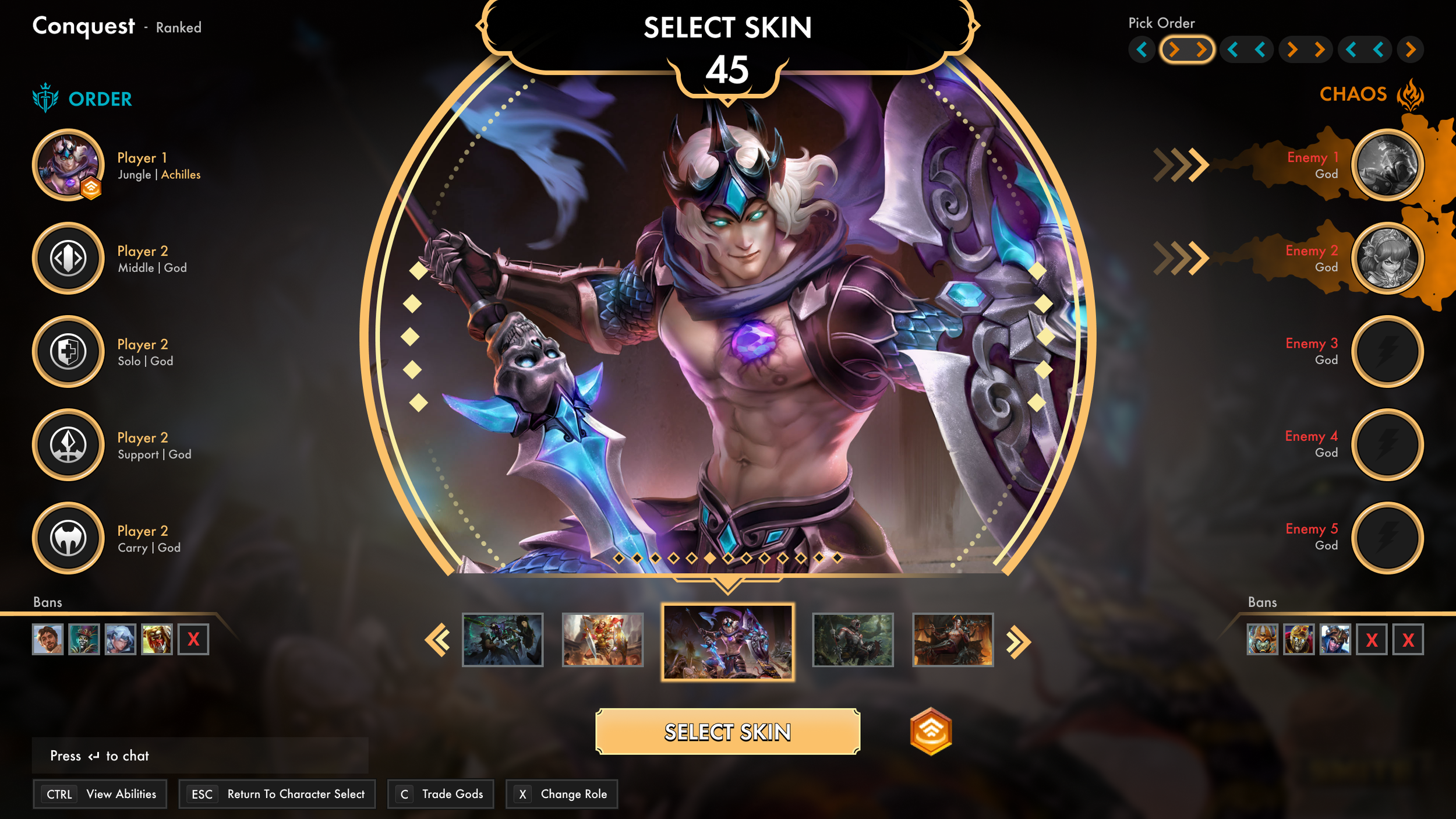
SELECT GOD SKIN

CONCLUSION
WHAT I LEARNED
Through this project, I learned the importance of balancing usability with a game’s unique visual identity. Applying standard design principles can greatly improve clarity and flow, but it’s equally important to maintain the personality and style that make a game memorable. The player feedback reinforced how vital community input is for refining design choices and finding the right balance between functionality and flair. Overall, this project strengthened my understanding of how thoughtful UI design directly impacts player experience and engagement.
OUTCOME
After sharing the redesigned mockups in the official SMITE server, the response was overwhelmingly positive, with around 90% of players reacting favorably. Many praised the cleaner layout and said the new design looked far more polished and intuitive than the current character selection screen. Some players, however, mentioned they would miss the 3D character models if the game transitioned entirely to 2D card art. A few suggested a hybrid approach that incorporates both styles, blending the clarity of 2D visuals with the dynamic presence of 3D models to preserve SMITE’s distinct personality.
